15 Best Paint Colors for Home Offices That Actually Boost Focus
Why the Best Paint Colors for Home Offices Actually Matter
I used to think paint color was the least important decision in setting up a home office. Get the desk right, get the chair right, get the lighting right, and the walls could be whatever leftover gallon was sitting in the garage. I was wrong, and I found that out the expensive way.
Three years ago I turned a spare bedroom into my home office. I picked a paint color in about four minutes flat, based on a photo I saw on Pinterest at 11pm. Within a week I was getting headaches by 3pm every single day, and I genuinely thought it was my monitor or my eyes.
Table of Contents
It wasn’t. It was the walls.
That experience is exactly why I’ve spent the last few years testing, repainting, and obsessively researching the best paint colors for home offices, both in my own house and in a few rooms I helped friends and clients set up. This guide is everything I’ve learned, including the mistakes, so you don’t have to repeat them.
My Home Office Paint Disaster (And What It Taught Me)
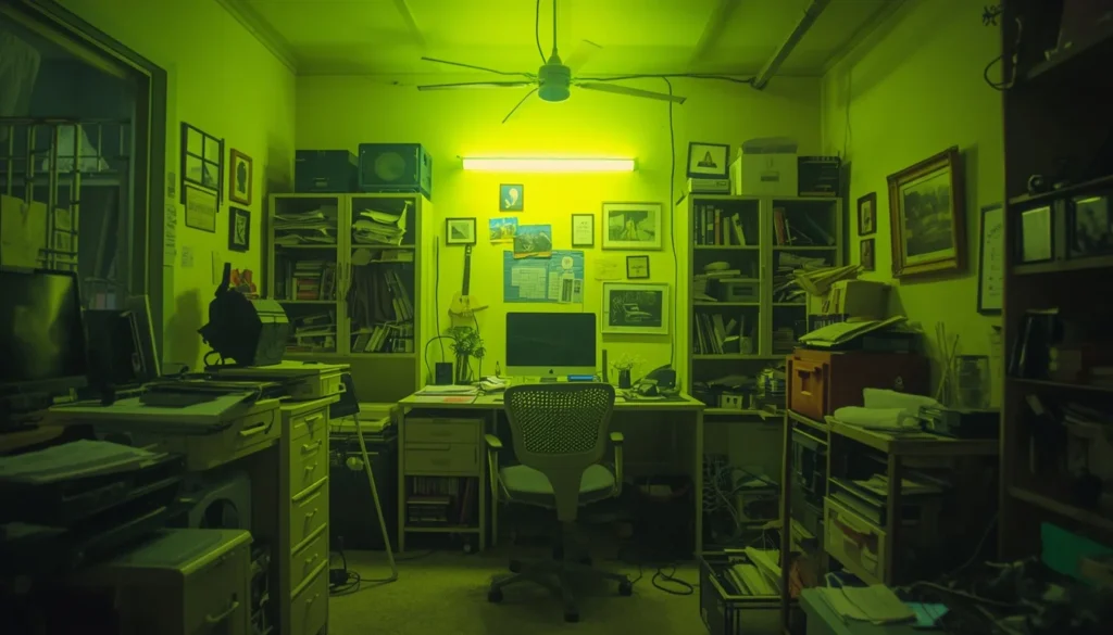
Here’s exactly what happened. I picked a bright, sunshine-yellow color because I read somewhere that yellow “boosts energy and creativity.” On the tiny paint chip in the store, it looked cheerful, almost like a happy little lemon.
On four full walls, under an overhead LED light, it looked like I was working inside a highlighter.
The problems showed up fast. My video calls looked washed out and slightly sickly, no matter how I adjusted my camera. I found myself squinting by early afternoon. And weirdly, I felt more anxious sitting at my desk than I did in any other room of the house, even though nothing else had changed.
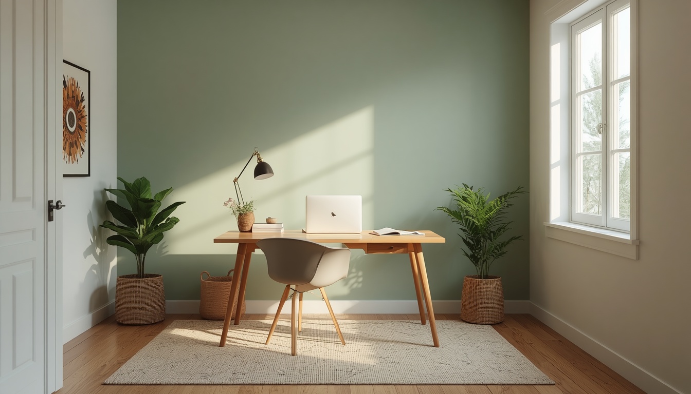
It took me about two weeks of feeling off before I connected the dots. I repainted with a muted sage green (color number 1 on the list below), and the difference was almost immediate. My eyes stopped straining, my video calls looked warmer and more natural, and honestly, I just liked being in the room more.
The lesson: a color that looks great on a tiny paint chip can behave completely differently across four walls, under artificial light, for eight hours a day. That’s the whole reason this guide exists.
How I Actually Test Paint Colors Now
After the yellow disaster, I built a simple process that I now use every time, whether it’s my own office or a friend’s. None of this is complicated, but skipping steps is exactly how mistakes like mine happen.
- Order actual samples, not just chips. I use peel-and-stick samples from Samplize, which are large enough (about 12×12 inches) to actually judge a color properly, unlike the tiny 2-inch chips at the hardware store.
- Stick samples on at least two different walls, including the one behind your desk (this is what shows up on video calls).
- Check the color at three different times of day: morning, midday, and evening with your lamps on. Colors shift dramatically depending on light temperature.
- Take a photo of your test wall and look at it on your phone screen, not just in person. If you do video calls often, this step matters more than people expect.
- Live with the sample for at least 3 full days before committing to gallons of paint.
If you want to skip physical samples entirely for a first pass, both the Behr ColorSmart app and Sherwin-Williams’ ColorSnap tool let you upload a photo of your actual room and preview colors digitally. I use these to narrow down my shortlist before ordering physical samples, not as a replacement for them.
The 15 Best Paint Colors for Home Offices, Ranked From Real Experience
This list isn’t ranked by trendiness alone. It’s ranked by what actually held up over months of real work, real video calls, and real natural light changes throughout the year. I’ve noted who each color works best for, since “best” always depends on your room.
1. Sage Green
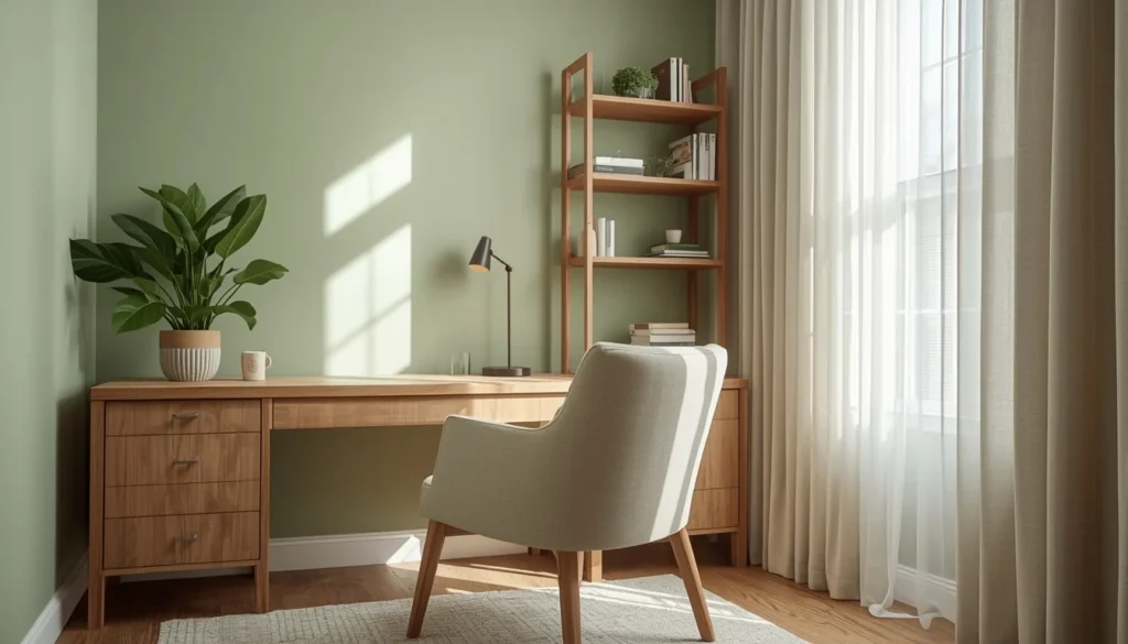
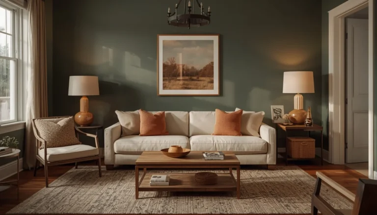
What it looks like: A dusty, grayed-out green (think Sherwin-Williams “Sage Green” or Behr “Backdrop”)
My experience: This was the color that saved my sanity after my yellow disaster. It’s calm without being boring, and it looks different depending on the light, which somehow never gets old.
Best for: North or east-facing rooms, plant lovers, anyone who stares at a screen all day
2. Soft Sky Blue
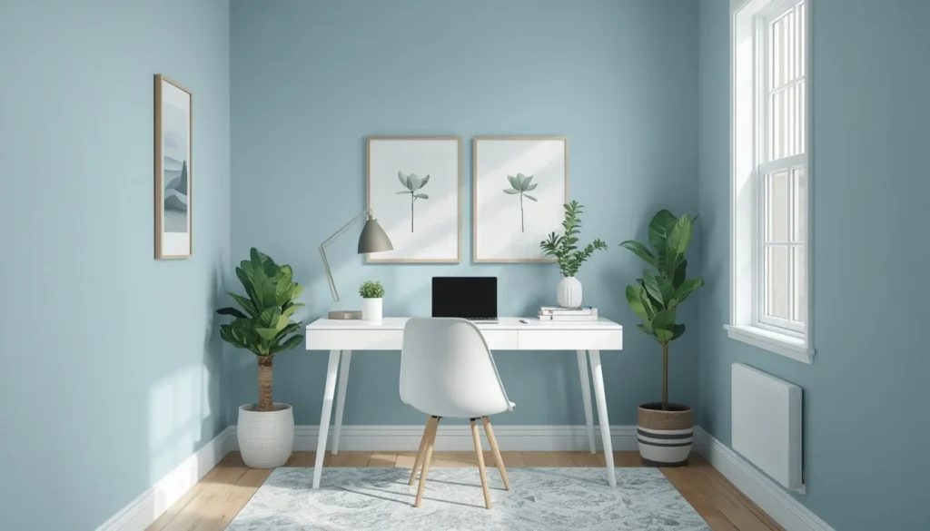
What it looks like: A pale, almost gray-blue, not a bright “kid’s room” blue
My experience: Blue has a reputation for being calming, and honestly it lives up to it. My friend Amir used this in his spare-room office and swears his heart rate drops when he walks in.
Best for: Small rooms that need to feel bigger, high-stress jobs, hot climates
3. Warm Greige (Agreeable Gray)
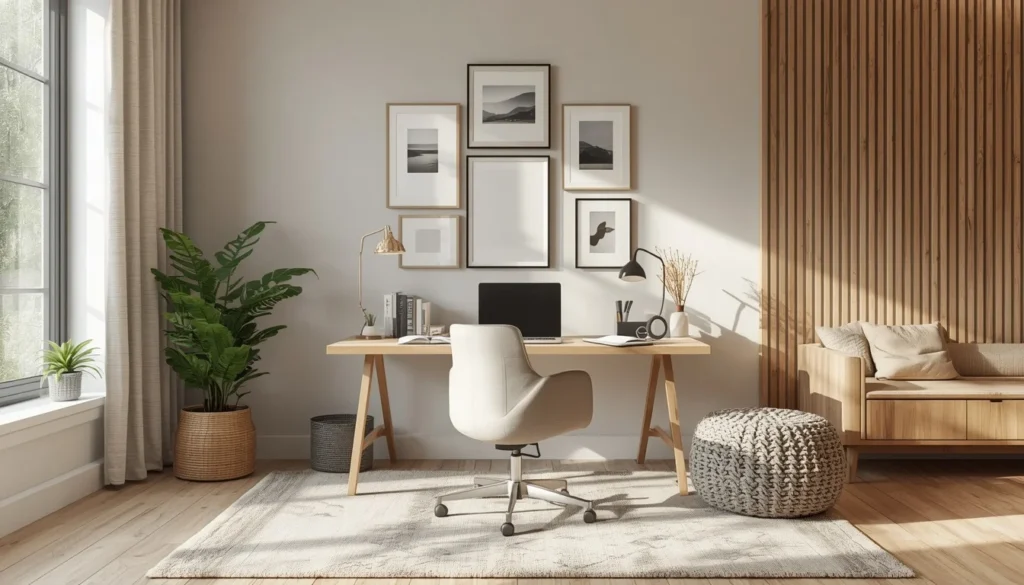
What it looks like: A gray with a warm beige undertone, Sherwin-Williams’ Agreeable Gray is the famous one
My experience: This is the safest color on the list. If you’re renting or planning to sell your house eventually, this is the one to pick. It never fights with your furniture.
Best for: Rentals, resale-conscious homeowners, mixed-style rooms
4. Deep Navy (accent wall)
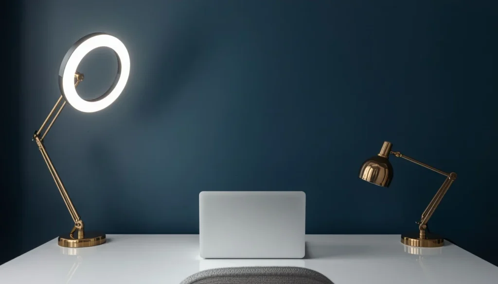
What it looks like: A rich, almost-black blue, best used on one wall only
My experience: I only did this on the wall behind my desk, on camera for video calls, and it made my whole setup look ten times more expensive than it actually was.
Best for: Video call backgrounds, bold personalities, rooms with good lighting
5. Warm Terracotta / Clay
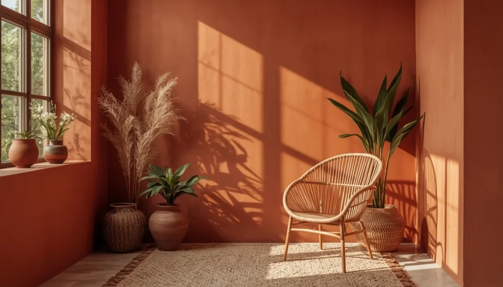
What it looks like: A muted orange-brown, more “desert pottery” than “traffic cone”
My experience: This one surprised me. I expected it to feel loud, but in a small office it actually felt grounding, almost like being wrapped in a blanket.
Best for: Creative work, small rooms, cold climates that need warmth
6. Muted Olive
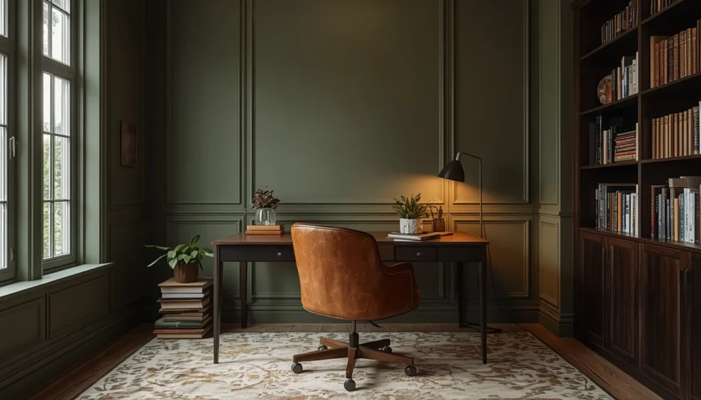
What it looks like: A dark yellow-green, more forest floor than lime
My experience: Olive is having a real moment right now, and after living with it for a year I get why. It hides scuffs from my desk chair better than any other color I’ve tried.
Best for: Rooms with wood furniture, moody aesthetics, low-light spaces
What it looks like: Not stark white, a white with a hint of warmth so it doesn’t look clinical
7. Cloud White / Soft White
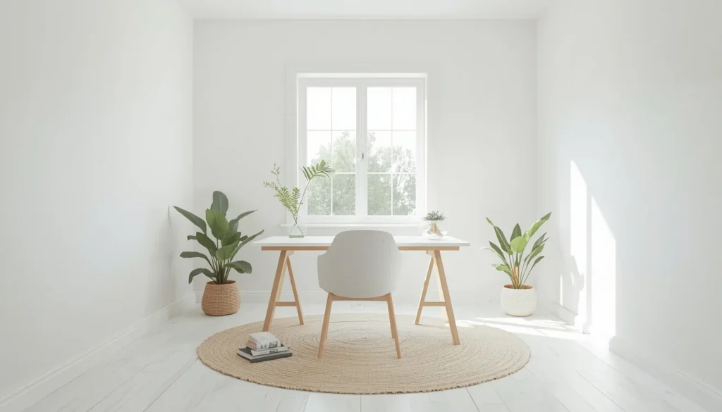
My experience: When I need a fully blank canvas for a photography or video project, this is what I paint. It reflects light better than any color on this list, hands down.
Best for: Small dark rooms, content creators, anyone who wants max brightness
8. Charcoal Gray
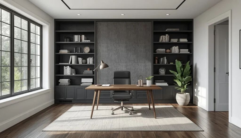
What it looks like: A near-black gray, usually used as an accent rather than all four walls
My experience: I only recommend this if your office gets a lot of natural light. In my north-facing spare room it made things feel like a cave, and I had to repaint within two months.
Best for: Bright rooms only, statement bookshelves, minimalist offices
9. Dusty Lavender
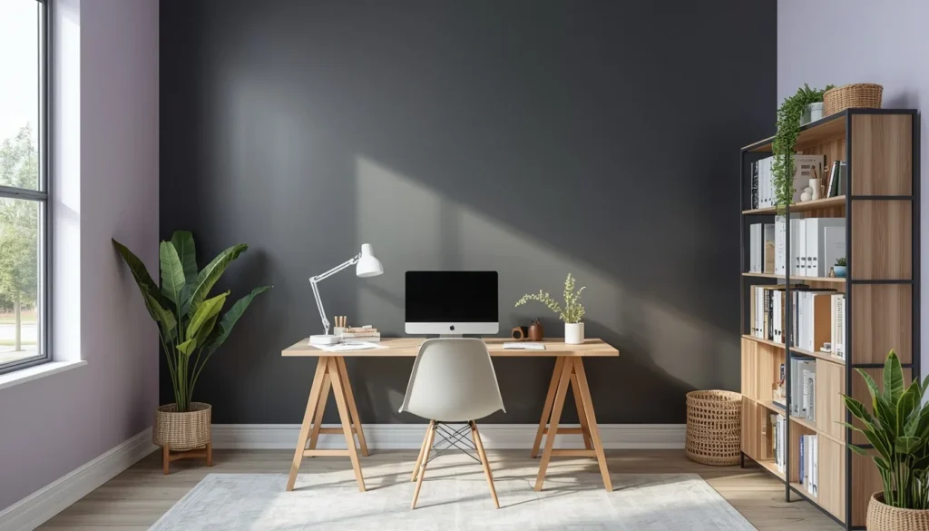
What it looks like: A grayed-out purple, closer to “stone” than “grape”
My experience: This is a color I didn’t expect to like. It photographs beautifully for Instagram, and it somehow works for both a traditional office and a more feminine craft-room setup.
Best for: Creative studios, guest-room-office combos, north-facing rooms
10. Soft Butter Yellow
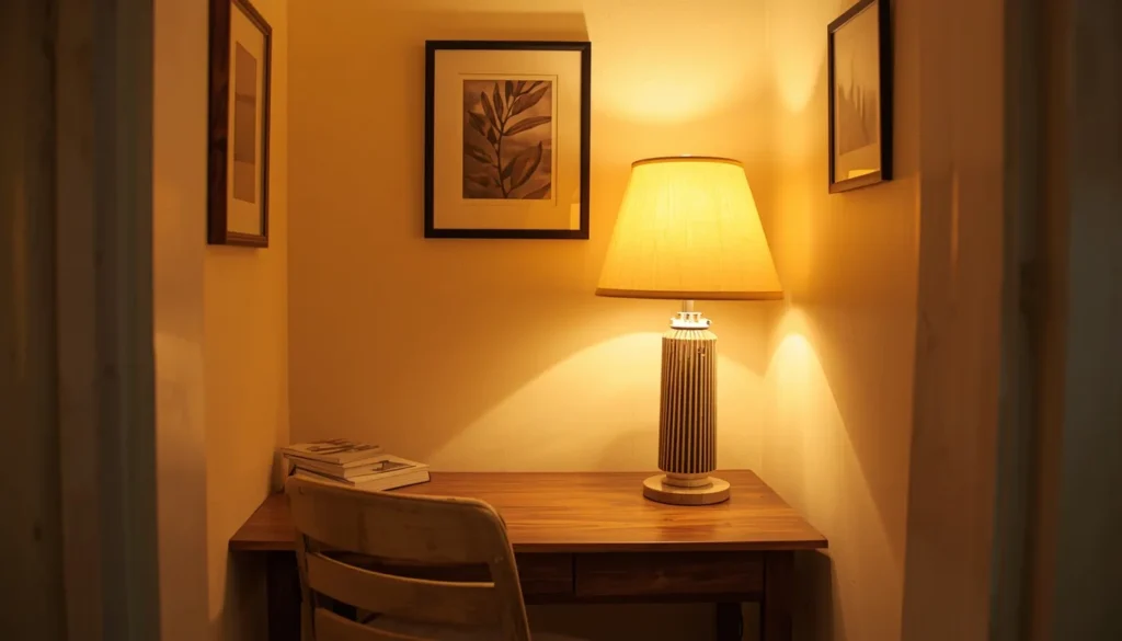
What it looks like: A pale, buttery yellow, not the neon version I made the mistake of buying
My experience: Yes, this is on the list despite my disaster story below. The trick is going three shades lighter than what looks good on the paint chip.
Best for: Rooms with little natural light, mornings-are-hard people, small nooks
11. Warm Taupe
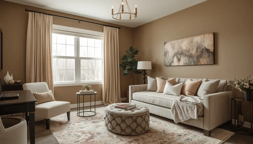
What it looks like: A brown-gray with a hint of pink or peach underneath
My experience: This is the color equivalent of a good pair of jeans. It goes with everything, it’s forgiving of clutter, and nobody ever notices it in a bad way.
Best for: Shared home offices, mixed-gender households, transitional style
12. Forest Green
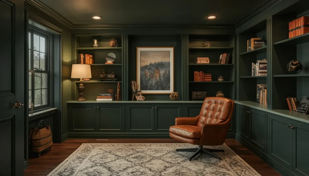
What it looks like: A deep, saturated green, darker and richer than sage
My experience: I used this in a client’s basement office and it turned what used to feel like a storage room into somewhere they actually wanted to work.
Best for: Basements, dens, book-lined rooms, cozy cabin vibes
13. Muted Blush Pink
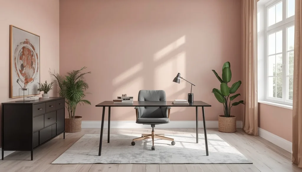
What it looks like: A dusty, grown-up pink, nothing like bubblegum
My experience: I was skeptical about this for a home office until I saw it done in a friend’s studio. It’s warm without being distracting, especially with black or brass accents.
Best for: Creative professionals, small guest-room offices, warm undertone rooms
14. Slate Blue-Gray
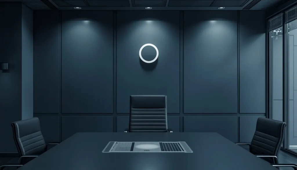
What it looks like: A cool, moody blue-gray, between navy and true gray
My experience: This is what I’d call the “quiet confidence” color. It reads as professional on video calls but still feels relaxed in person.
Best for: Corporate-from-home workers, video-heavy jobs, modern furniture
15. Warm Alabaster White
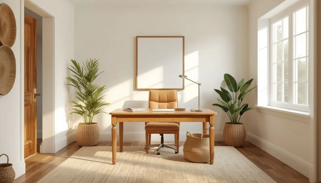
What it looks like: Benjamin Moore’s famous soft, creamy white
My experience: This is the one I’d tell a total beginner to just pick and stop overthinking it. It’s warm, it’s flexible, and it makes almost any furniture look intentional.
Best for: First-time painters, rentals, anyone overwhelmed by choice
Comparison Table: Best Paint Colors for Home Offices at a Glance
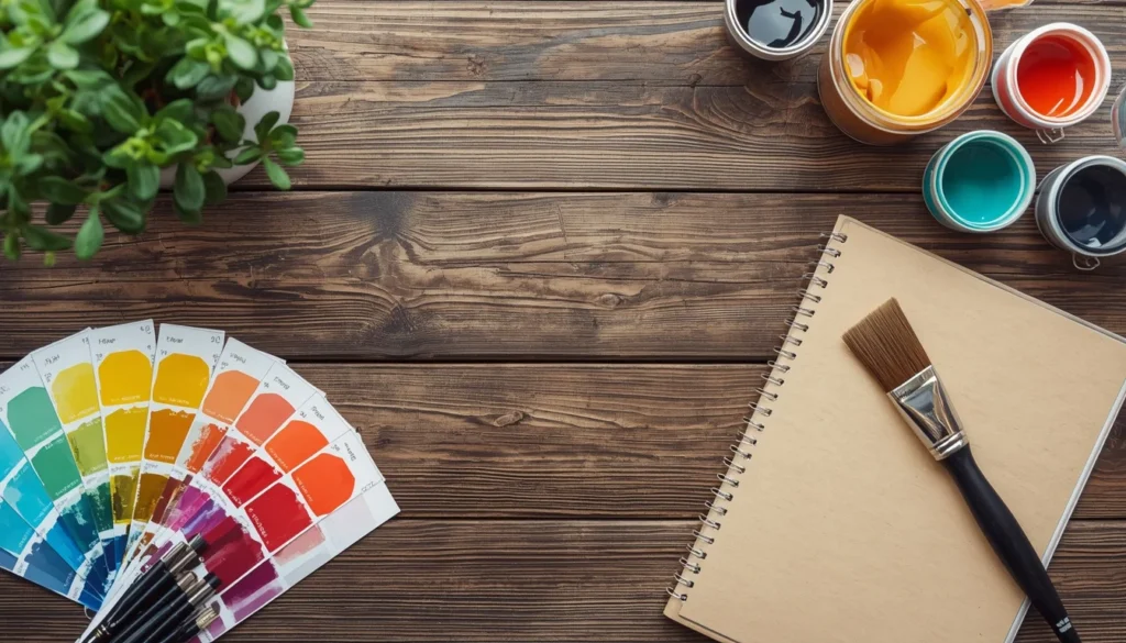
If you’re short on time, here’s the whole list side by side. This is the exact chart I wish I’d had before my yellow-wall phase.
| Color | Best For | Mood It Creates | Light Needed | My Rating (out of 5) |
| Sage Green | Focus & calm work | Grounded, natural | Any | 5 |
| Soft Sky Blue | Stress reduction | Peaceful | Any | 4.5 |
| Warm Greige | Resale value | Neutral, safe | Any | 4.5 |
| Deep Navy (accent) | Video calls | Bold, premium | Bright rooms | 4 |
| Terracotta | Creative work | Warm, grounding | Any | 4 |
| Muted Olive | Wood furniture rooms | Moody, cozy | Medium-bright | 4 |
| Cloud White | Content creation | Bright, clean | Any | 4.5 |
| Charcoal Gray | Statement accent walls | Dramatic | Bright only | 3 |
| Dusty Lavender | Craft/creative studios | Soft, unique | Any | 3.5 |
| Butter Yellow | Low-light rooms | Cheerful | Low light | 3.5 |
| Warm Taupe | Shared offices | Balanced, safe | Any | 4 |
| Forest Green | Basements/dens | Cozy, rich | Any | 4 |
| Muted Blush Pink | Creative professionals | Warm, soft | Bright | 3.5 |
| Slate Blue-Gray | Corporate video calls | Professional, calm | Any | 4 |
| Warm Alabaster | Beginners/rentals | Flexible, warm | Any | 5 |
What’s Trending in Home Office Colors for 2026
Home office color trends have shifted a lot since everyone first started working from home. Bright, energetic colors are giving way to something calmer and more grounded, and it lines up with what I’ve actually noticed in my own work.
- Nature-inspired tones (sage, olive, terracotta) are replacing bold primary colors as the default choice for focus-driven spaces.
- Warm neutrals are overtaking cool grays, since cool grays were the dominant trend from 2015 to about 2021 and now feel a little dated and clinical.
- Single accent walls, especially in navy or charcoal, are popular specifically for people who do a lot of video calls.
- Color-drenching, painting walls, trim, and even ceiling in the same shade, is showing up more in small home offices to make cramped rooms feel intentional instead of chaotic.
For a deeper look at how color psychology actually influences mood and focus in a workspace, this research summary from Verywell Mind is a solid, non-fluffy starting point.
Step-by-Step: How to Pick the Right Paint Color for Your Home Office
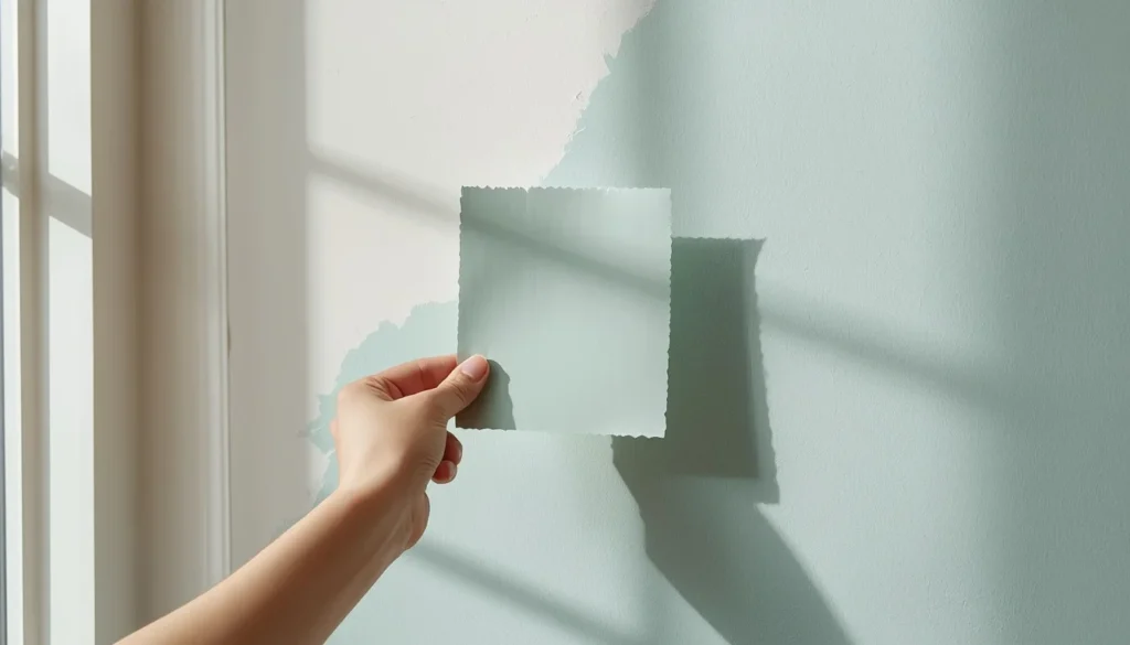
Here’s the exact process I now walk friends through when they ask for help. It takes a weekend, and it’s saved every single person I’ve shared it with from a repaint.
- Figure out which direction your windows face. North-facing rooms get cooler light and can handle warmer colors. South-facing rooms get warm light and can handle cooler colors better.
- Decide what the room needs to do besides work. If it’s also a guest room or craft space, lean toward more flexible, warm neutrals instead of bold statement colors.
- Shortlist 3 colors max. More than that and you’ll just get overwhelmed and default to whatever’s cheapest at the store, which is how a lot of accidental beige rooms happen.
- Order large samples and test on the wall behind your desk first, since that’s what shows up on calls and in photos.
- Paint a small section near a light switch or outlet so you can patch it easily if you change your mind.
- Live with it for a few days before buying full gallons. Colors that feel fine on day one sometimes feel different by day three.
- Choose a matte or eggshell finish for walls, since satin and semi-gloss show glare on video calls and under desk lamps.
Common Mistakes People Make When Painting a Home Office (I Made Half of These)
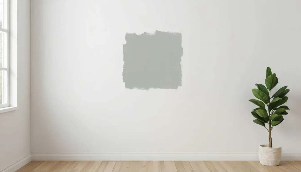
- Picking a color from a tiny paint chip instead of a full-size sample, exactly what caused my yellow-wall disaster.
- Ignoring the wall behind the desk, which is the one wall that shows up on every single video call.
- Choosing a trendy color without checking how it looks under your actual lighting, especially LED bulbs, which can shift undertones.
- Going too dark in a room with little natural light, which can make a small office feel like a cave rather than cozy.
- Using a glossy finish, which bounces light and glare directly into your camera during calls.
- Painting the whole room before living with a sample, then discovering it looks completely different once it’s on all four walls.
- Forgetting that colors look different next to your specific furniture and flooring, not just in isolation on a swatch.
Real Examples From Real Rooms
A few quick examples from rooms I’ve actually seen this play out in, not staged photos from a catalog.
My own spare-room office: Repainted from bright yellow to sage green. Headaches gone within a week, video call lighting noticeably warmer and more flattering.
My friend Amir’s converted closet office: Went with soft sky blue in a tiny 6×6 foot space. The pale color made the cramped room feel noticeably bigger and calmer on stressful days.
A client’s basement office: Forest green on all four walls turned a dim, unused storage room into their favorite spot in the house, paired with a warm floor lamp instead of overhead lighting.
My cousin’s shared guest-room office: Warm taupe, because it needed to work as both a functional office and a welcoming guest room without looking like two different rooms mashed together.
Related Reading on the Site
If you’re working through a full room refresh, a couple of related guides worth checking on ToolStackz might help round out your plan, including our pieces on small-space furniture layouts and cozy patio color palettes for the rest of the house.
Helpful External Resources
Sherwin-Williams’ full color visualizer tool is genuinely useful for testing shades digitally: ColorSnap Visualizer.
Benjamin Moore’s Color of the Year archive is a good gut check on what’s trending each year: Benjamin Moore Color Trends.
For the psychology side of things, this is a clear, well-sourced overview: Verywell Mind on Color Psychology.
FAQs About the Best Paint Colors for Home Offices
What is the single best paint color for a home office?
There’s no single universal answer, but sage green tends to work across the widest range of rooms because it’s calming, hides scuffs well, and looks good on video calls in almost any lighting.
What paint color should I avoid in a home office?
Bright, saturated yellows and stark, cool-toned whites are the two I’d avoid, based on personal experience. Bright yellow caused eye strain for me, and cool white can feel clinical and washed out under LED lighting.
Do darker paint colors make a small home office feel smaller?
Not always. A dark color on all four walls in a small, dark room can feel cramped, but the same dark color used as a single accent wall, or in a room with strong natural light, can actually make the space feel cozier and more intentional.
What paint finish is best for a home office?
Matte or eggshell finishes are best. Satin and semi-gloss reflect more light, which shows up as unwanted glare on video calls and under desk lamps.
Does paint color really affect focus and productivity?
Color psychology research suggests muted, natural tones like greens and blues are associated with calm and focus, while very bright or saturated colors can be more stimulating or even distracting over long periods. My own experience lines up with that research pretty closely.
Final Thoughts
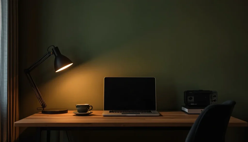
Paint color feels like a small decision until you’re sitting in that room for eight hours a day, five days a week. I learned that the hard way with a wall of bright yellow that I loved for exactly one afternoon.
If you take one thing from this guide, let it be this: order the big samples, test them on the wall behind your desk, and give it a few days before you commit. Everything else on this list is just a starting point for your own trial and error.
Whatever shade you land on, chances are it’ll serve you a lot better than the one I picked at 11pm off a Pinterest photo.