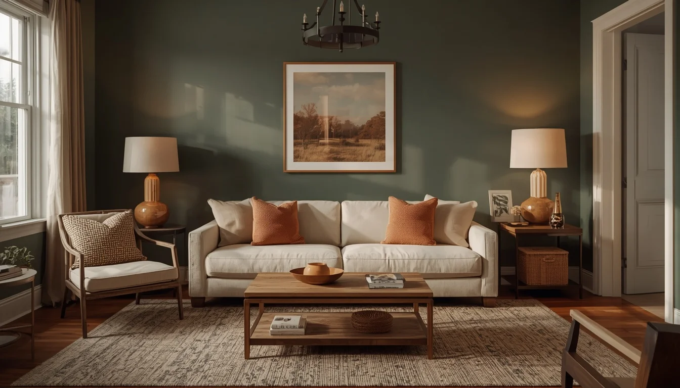
Pewter Green Living Room Ideas That Feel Effortlessly Calm
A client of mine moved into a rental with a living room that felt strangely flat — beige walls, beige carpet, beige everything, the kind of space that photographs like a hotel lobby nobody chose to be in. She wanted color but was terrified of picking something she’d regret in six months. That’s how we landed on pewter green, and it turned out to be one of those decisions that solved more problems than either of us expected going in.
Table of Contents
The Problem: A Room With No Personality and No Confidence
Most living rooms that feel flat aren’t missing furniture — they’re missing a color anchor. Beige-on-beige gives you nothing to build around, and every accent piece ends up fighting for attention instead of working together. My client’s instinct was to go bold — a deep navy or a saturated forest green — but that felt too risky for a rental where resale-neutral choices matter for getting a deposit back.
What Most People Try First (and Why It Often Fails)
The first instinct is usually an accent wall in a trendy, high-saturation color. It looks great in the paint store lighting and often falls apart once it’s on a full wall under regular household lighting, especially in rooms that don’t get strong natural light all day. Pewter green avoided that trap because its grey undertone keeps it from looking garish under warm bulb lighting or cool daylight — it adapts instead of clashing.
The Better Approach: Building Around a Muted Anchor Color
We started with a single wall — the one behind the sofa, since that’s the backdrop most visible from the entry — painted in a pewter green eggshell finish. Direct answer to what everyone asks next: yes, a single
accent wall is enough to establish the palette without overwhelming a rental-neutral space, and it’s also the easiest to repaint back to white before moving out.
Choosing the Right Sofa Color Against Pewter Green
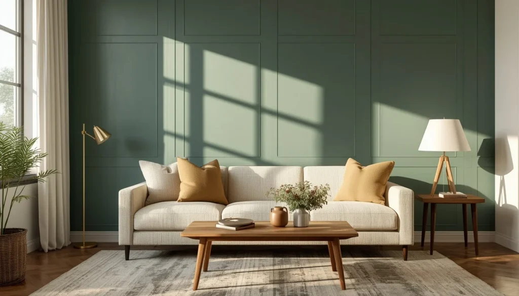
What Sofa Color Works Best With a Pewter Green Wall? Direct answer: cream or warm oatmeal tones create the strongest, most livable contrast, while a matching green sofa tends to flatten the whole room into one note.
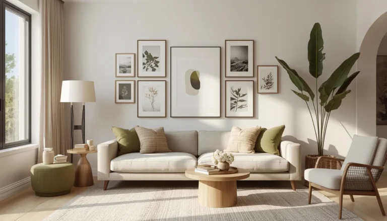
We went with a cream boucle sofa, and the texture did as much work as the color — pewter green plus a flat cream fabric can look a little sterile, but a textured fabric adds the warmth the palette needs.
Layering in Wood Tones
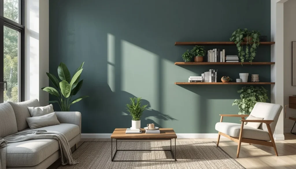
The coffee table and floating shelves came next, both in a mid-tone walnut. Here’s what most people get wrong: they pick wood that’s too light or too cool-toned, which competes with pewter green’s own cool undertone rather than balancing it. Warmer woods — walnut, oak with an amber finish — do the balancing job pewter green actually needs.
Textiles: Where the Room Started to Feel Finished
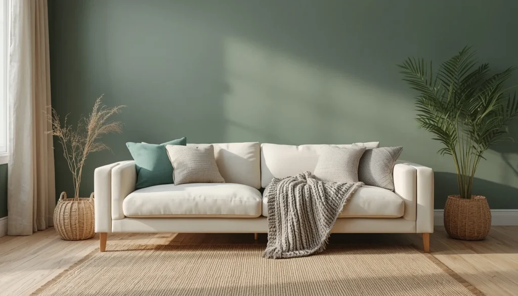
A room this muted needs texture more than it needs additional color. We brought in a chunky knit throw, a jute rug, and linen curtains — all neutral, all textured. This is the point where the living room stopped looking like a paint sample and started looking like somewhere people actually wanted to sit.
What About Small Living Rooms?
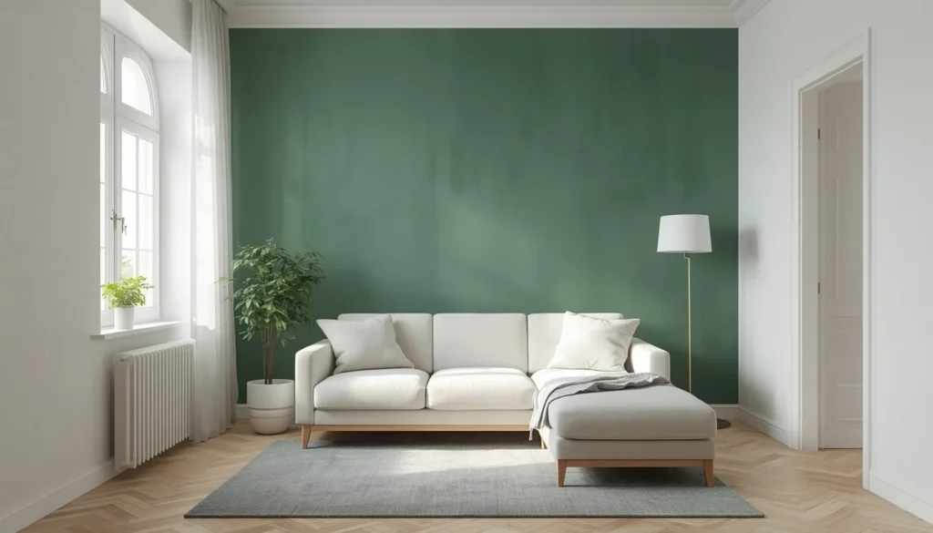
We later did a version of this in a much smaller apartment living room, and the biggest lesson was restraint: painting all four walls pewter green in a small space with limited light made the room feel closed in rather than cozy. Keeping it to one or two walls, with the rest in a soft white, let the color read as intentional rather than heavy.
Bringing in Black Accents for Contrast
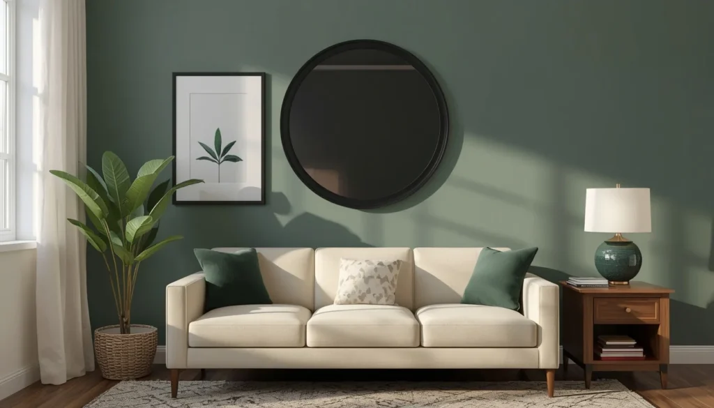
Once the base palette felt settled, black metal picture frames and a black-framed mirror went in. This kept the room from tipping too soft — every space needs at least one sharp, high-contrast element or it starts to feel a little sleepy.
Lighting Changes Everything With This Color
One thing that surprised both of us: the same paint swatch looked almost silvery-grey under the room’s north-facing daylight and noticeably greener under warm 2700K bulb lighting in the evening. If you’re testing pewter green for a living room, look at the sample under both conditions before committing, especially if your room doesn’t get consistent light throughout the day.
Plants Softened the Whole Space
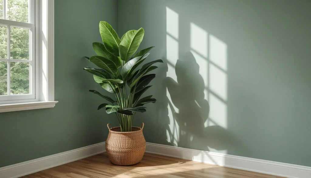
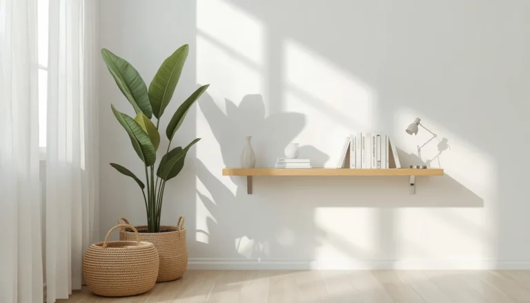
A few large-leaf plants — a fiddle leaf fig, a snake plant — went into the corners last, and they did something unexpected: they made the pewter green read even calmer, because live greenery next to a muted painted green creates a gentle gradient rather than a hard color contrast.
Where the Room Landed
Six months later, the living room still gets used as the main hangout space it was designed to be, which sounds obvious but honestly isn’t always the outcome with a bold color decision. The mix of pewter green, cream, walnut, and black ended up feeling less like a trend and more like a decision that will still make sense in a few years, which was really the whole goal from the start.
Common Mistakes to Avoid
Painting every wall the same saturated pewter green without a lighter counterpoint is the most frequent misstep I see. A close second is pairing it with cool-toned grey furniture, which erases the warmth the color needs to feel inviting rather than clinical.
FAQ
Is pewter green too trendy for a living room?
Its muted, grey-based undertone gives it more staying power than brighter greens that tend to date quickly, making it a safer long-term choice.
What curtain color goes best with pewter green walls?
Warm white or natural linen curtains tend to soften the room without competing with the wall color.
Can pewter green work in a living room with little natural light?
Yes, but test the paint sample under your room’s actual evening lighting first, since it can read darker and cooler in low light than in a showroom.
What’s the biggest mistake people make with pewter green living rooms?
Skipping warm wood and metal accents, which leaves the room feeling flat and overly cool instead of balanced.